Brand Guidelines
Logo
Colors
Typography

Voice & Tone
Photography
Icons
Please be aware that when you use our assets, you are adhering to our Terms & Conditions.
Our Logo

Our Symbol
Light and Dark Mode

Clearspace
Our logo needs breathing room.
To ensure it’s always clear and impactful, we must maintain a protected area of clearspace around it.
This rule keeps other elements from getting too close.
Horizontal lockup

Vertical lockup
On Images
To maintain readability, the logo must have high contrast with its background. When placing it on a photo or complex image, always select the logo version (e.g., color or white) that stands out the most.

This image has a deep, dark background, so we use the white logo. Our yellow symbol and white text create high contrast against the background.

This image has a bright, clear background, so we use the full-color logo. Our yellow symbol and grey text create high contrast against the background.
Things to Avoid

Colors
Highlight Yellow
This is our primary accent color, used to draw attention and add a flash of energy. Use it sparingly for maximum impact.
Best for: Key headlines, calls-to-action, or as a contrasting text color on dark (blue) backgrounds.
Do not: Use this for large blocks of color or body text.
#FFCC26
Primary Blue
This is our core brand color and the most recognizable part of our visual identity. It should be the dominant color in most designs.
Best for: Main headlines, highlight text, “Solution” icons, and primary brand moments.
#2A71DB
Body Text
This near-black is our primary color for all text. It’s used to ensure high readability without the harshness of a pure black.
Best for: All body copy, paragraphs, and most sub-headlines.
#0A090B
Secondary Text
This muted grey creates a clear visual hierarchy. It’s used for supporting information that should be less prominent than the main text.
Best for: Small description text, captions, “Pain Point” headlines, and other non-critical information.
#4F4D55
Canvas
This is our standard background color. It provides a soft, clean, and modern canvas for our content, and is preferred over pure white for most applications.
Best for: Slide backgrounds, web page backgrounds, and general layout.
Note: Pure White (#FFFFFF) may be used as an alternative background when layouts require higher contrast or include layered grey boxes.
#F9F9F9
Typography

Weight
To create a clean, consistent, and easy-to-read layout, we use four specific weights of our brand font. Each weight has a distinct purpose.
Light
Use this weight sparingly for an airy, sophisticated feel. It is best reserved for large, “display” text, such as a major tagline on a presentation slide or a large customer quote.
Note: Avoid using Light for small text or long paragraphs, as it can be difficult to read.
Regular
This is our primary, default weight for all body text. It is optimized for maximum readability in paragraphs, lists, and most general content.
Medium
Use Medium for sub-headlines, key callouts, or to add emphasis within a block of text. It creates a clear secondary level of importance and works well for text on colored backgrounds.
Semi Bold
This is our heaviest weight, reserved for all primary headlines and high-priority statements. It’s designed to grab attention and establish the most important message.

Sizing
Maintaining proportions will achieve important hierarchy. Use this size guide as a starting point but never sacrifice legibility.

Photography
Section

Icons
Style
We keep our icons uniform by using an unfilled style with a thin stroke.
You can use an icon by itself or contain it in a shape.
Library
Most of our icons come from the Material Symbols & Icons library.
The library is available from Google.
We’re excited to partner with you.
To make it easy to announce our partnership, we’ve gathered our key brand assets and a few simple rules. Our main goal is to ensure the OpenSolar brand is always presented clearly and professionally.
Important: To ensure brand alignment, please obtain approval before publishing any branded materials. Send your final designs to [email protected]; our team will provide a prompt review.
Partner Resources
To get started, download the Partner Pack.
The pack includes:
Logos
Official OpenSolar brand marks available in PNG (optimized for digital) and SVG (high-resolution for print). Includes primary color and monochrome white variants for dark backgrounds.
Boilerplate
Standardized company descriptions and naming conventions. Use these pre-approved texts to ensure brand consistency across all press and media mentions.
Co-branding Templates
Professional announcement templates provided in portrait (Instagram) and landscape (Web Banner) formats. Each set includes “Clean” layouts for production and “Example” versions for guidance.

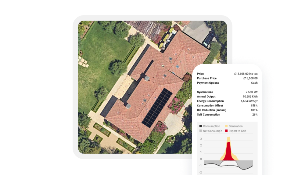
To ensure OpenSolar is always represented accurately and professionally, please use these official, high-resolution product shots rather than taking your own screenshots.
We have curated a library of our key features to help you showcase the platform effectively.

Usage Guidelines
Do Not Alter
Please do not crop, distort, or apply color filters to these images.
Keep It Current
These images reflect the latest version of our UI. Please avoid using older screenshots found online.